Sunday, November 6, 2016

WAITING FOR THE MAN

And what better place to wait than Waiting Room "B"

Just over a week ago I attended a couple of events in London to mark the conclusion of the second phase of Project Soane.  It was a great pleasure to meet Melissa & Graham  of RAMSA who were instrumental in setting up Project Soane in the first place.  We had lots of fun sharing ideas and enthusiasms.  I can never thank them enough for dreaming up the idea of recreating the Old Lady of Threadneedle Street in the cloud. 


And of course Sean Young is "The Man" who kept the wheels turning and persuaded me to take a detour via London on the way back from Porto.  In Porto I ran into Kyle Bernhardt of C4R who came up with the idea of putting Project Soane onto that cloud based collaboration platform.  We did just that, together in one of the speaker rooms, and this weekend I had my first chance to give it a serious whirl.  Very happy to report that it's performing really well so far.


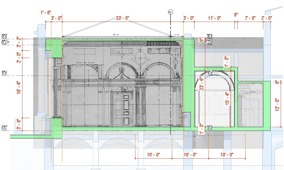
I have been studying the survey drawings by the office of F.W.Troup that were made in the 1920s prior to demolition.  Troup did some schemes for the redevelopment of the bank before the governors decided to appoint Herbert Baker for the job.  The drawings are in fold-out sheets at the back of a second hand book that I picked up earlier this year.  I've photographed these and started to paste them into Revit views where I can scale them up, make some construction lines and figure out the key dimensions. 


I'm focusing on the Court Suite area, which is the least well developed at present of all the areas where Soane did some serious work.  It's not easy to figure out what he was up to here, but I'm starting to see the light.  As usual it's about a series of spaces with contrasting proportions and surprisingly inventive lighting.  He was creating new offices for the Governor & Deputy Governor, and reorganising the circulation in this whole zone.  The two major spaces (Court Room & Committee Room) remained as Taylor had designed them, as did the Entrance Lobby, but everything else was completely reworked.


The two small waiting rooms (A & B) are quite intriguing, so I decided to make a massing model (Generic Model Family). He created a square in the middle and covered it with a groin vault.  In the centre of this is a small lantern.  I was wondering how he had managed to resolve the junction between the cross of the fault and the circle of the lantern when I noticed the corner of the pendentives.  There is a device here that Soane used in some of his canopy ceilings.  (the breakfast room in his own house for example)  I'm not sure where this first came from, but it reminds me of pleats in dressmaking which help to make cloth fall more naturally.


I don't have a photo of the lantern, but I'm guessing that it's octagonal, and that the "pleats" help to blend the ceiling into the circular eye that it sits on.  I think this will repay further study later on, but for now I wanted to move on to adjust the setting out of the walls in this whole area.  Troup's survey gives me a set of dimensional checks and I need to make some corrections to my first-pass layout.  The current model is based on several simplifications and rationalisations.  There's going to be a certain amount of conflict and compromise.  We will never get every dimension to match up exactly with the source material, but we must aim to represent the size and proportions of all the parts without undue distortion. 


I set up a detail group (2d drafting) that is placed twice.  One is overlaid over a plan view of the model, the other over part of Troup's survey plan.  Placing the whole survey plan onto the model is quite confusing.  If you get one corner lining up nicely, the opposite corner gets into a tangle.  So this solution allowed me to jump backwards and forwards between two fairly clear pictures and gradually reach an acceptable compromise.

The translucent green filled region is my proposal for adjusting the walls, and once I had it in reasonable shape, I copy-pasted it into the C4R version of the model.


Then I set to work, and with frequent checks against the photos and survey sections that I had marked up, was able to make a reasonable stab at how the roofscape was developed.  Bear in mind that up until yesterday, this whole area was just covered with a flat slab.  I just had no idea which parts were higher and lower, how the light got in, how the space was drained.


What I have now, (and you can see the results on A360 if you are registered for Project Soane), is a useful first stab at Soane's remodelling of the Court Suite, and especially the waiting rooms and lobbies.  From here we can proceed to add detail and fine tune the setting out.


Hopefully this is the beginning of a new phase of Project Soane.  We have a much improved collaboration platform, and the whole of the bank is now roughed out.  The two banking halls that were modelled by Russel and Alberto during phase one have been taken to a much higher level of detail.  One task, moving forward would be to take other areas that I have roughed out and bring them up to a comparable standard.  Another area that I have started to look at is the development of the design over time.  I have not yet uploaded that massing model to A360, but I do intend to.  There is much more that could be done to understand the building as a sequence of events: demolitions and reconstructions, adaptations, rebirths.


Let's finish with a shot of three gentlemen, meeting up one afternoon in London, en route from Portugal to various other destinations.  Sean Young from HP has become a good friend, and although the sponsorship phase of Project Soane has run its course, I'm sure will continue to take an interest in whatever the community he helped to found chooses to do moving forward.  Randall Stevens is the man from Archvision and Avail, two very interesting contributions to the ever-expanding world of BIM software, one well established, the other quite new.  He has also become a good friend and it was great to hang out again.


Friday, October 28, 2016

DURABILITY

Konigsplatz in Munich is a set piece of Neoclassical urban design by Leo von Klenze, court architect to the king of Bavaria.  I stopped off there, pretty much straight from the airport.  I thought it would be interesting to compare this rather formal, academic style with Soane's more idiosyncratic interpretation of the classical orders.  My first shot illustrates the endless variation that is possible within the classical idiom.  Notice the frieze running around the neck of the column, somewhat unusual for an Ionic capital.


This is really a continuation of my previous post where I shared my "tips and tricks" from Washington.  The next one is from my second session. This is me on one of my hobby-horses, pushing the idea that we shouldn't restrict BIM to our day jobs.  I like to think of the "BIM pencil" as an all-purpose thinking tool that can be used in any context where buildings are involved.  My current focus is historical research, but I've long thought that it would be interesting to use BIM tools to develop a reference work like Neufert, or AJ Metric Handbook.  Could be in book format, could be a website, could be really good, what do you think?


Back to von Klenze, and some running ornament. Not sure what this is called, but it's a flattened out version of something that Soane also used.  The flower motif that pops up between the "tongues" must be honeysuckle, also known as woodbine.  That also features quite a bit in the Bank of England.  The abstraction of this Bavarian version reminds me of Soane in his "inventive simplification" mood, which seems to have come and gone depending on the budget available and what the critics had been saying about him recently.


How about a bit of Corinthian?  This one is for Paul Aubin, currently playing with drones in Tuscanny.  It's "light and curly" feel is similar to the one Paul created as a virtuoso exercise in "Point World" geometry.  This also features honeysuckle, a rather unusual choice for the flower motif, and the whole thing has a completely different feel when compared to Soane's version at the bank, which I modelled in a very clunky but surprisingly effective way about a year ago.


Next tip, and this one is from the lab I held in Porto last week.  It's also a fairly conventional tip, and a rework of one I gave in a post I did earlier this year when I was starting off on my "modular doors" idea.


Now for a building by Paul Troost, who was one of Hitler's favoured architects.  Like Albert Speer he used a kind of "stripped classicism" which could be interpreted as taking the simpification that Soane & von Klenze explored and taking it much further so that you get a kind of hybrid between Modernism and Classicism.  There were lots of people who did this in the first half of the twentieth century, but as a style it has become rather tainted by it's association with Hitler (and Mussolini)  This building operated as a Music School for many years, but appears to be empty at the moment.


Another doors tip next.  Seems very obvious, but it's something I missed when I first started making doors, and talking to others at the conference in Porto I found that I wasn't the only on who found the default orientation of doors rather illogical.  But however logical it may seem to "correct" the default template, sooner or later it will get you into trouble when you swap out one of your doors with one made "the default way".


And back to Konigsplatz, this time a panorama of the whole thing, two buildings and a gateway.  Soane would have been really jealous of this kind of commission.  He longed to have a noble patron who would give him the task of devising a monumental civic work to ennoble the city.  For my money though, he was much better off hammering away at the thorny problems he was given to solve by the governors of the Bank of England.  Commercial clients represented the future of architectural patronage in an industrialising world and ultimately Soane helped to shape the modern profession based on his experience working with the governors of the Bank.


Now for a tip from my Project Soane session in Porto.  This addresses the thorny question of LOD and what represents good practice in family editor.  In my view there are very few hard and fast rules.  You have to asses the situation you are in and model accordingly.  Sometimes a really simple and elegant solution may fit the bill.  At other times you might have to compromise and accept something slightly "hacky" that captures the design intent by fooling the eye into seeing more detail than is actually there.


Many of the classical buildings in Munich use a type of stone that seems to have air bubbles in it, sort of a bit like travertine but without the marble quality.  I would love to know if this stone has a particular name and where it comes from.  I'm assuming it is local to the Munich area, but that's just a guess.  Was it used because architects liked the texture? or was it just because it was available?


On our day trip to Nuremberg we came across the house where Albrecht Durer lived.  We didn't have time to go inside.  Durer's father was a goldsmith who moved from Hungary to Nuremburg in early manhood, but the son showed such precocious talent in drawing as a teenager that he was apprenticed to an artist/printmaker.  I was first introduced to his work by my father, who taught me that one of the best ways to understand how something works is to draw it.  The act of drawing is a powerful tool for understanding how something works, what really makes it tick.  I like to think of BIM tools like Revit as "pencils with super powers".  I construct virtual models in order to gain a deeper understanding of a particular building, architect, style or technology.  In that sense I see my work as a continuation of the renaissance tradition established by master draughtsmen such as Durer


My final "triptix" follows on from this.  Masterful technique is essential to Durer's art, but it is not an end in itself.  Far too often we measure our worth by our technical skill, showing off and calling ourselves "guru" or "expert elite".  That's all well and good, but ultimately you either have something worthwhile to say or you don't and no amount of clever trickery will substitute for insight into the human condition, emotional impact, wisdom and compassion.  I would rather touch someone's heart than blow them away with my virtuosity.  Shakespeare was a master of language, but what really makes his plays immortal is his ability to make us see ourselves afresh, to identify with his characters and to be deeply moved  by the tragicomic poetry of life itself.


Love and lust are common themes in Shakespeare, but less obviously so in architecture, unless perhaps you count the voluptuous curves of a baroque church or a Gaudi roofscape.  I am not a great fan of phallic symbols, but if you are going to stray in that direction, do it with style and proportion, as in the image below: a stone buttress at the corner of Durer's house.  Debates about architectural style can often take on a moralistic tone.  Copying the modernism of 100 years ago is somehow more "honest" than taking inspiration from Soane's classicism of 200 years ago.  To me the issue is not so much about which precedents you choose to take as your starting point, but how well you handle the universals: proportion, rhythm, texture, light and shade ... and of course your ability to find a form that is appropriate to the project (its function and its setting)


And so we come back to Zepellin Field.  My final image shows one of the terraces that surround and define the space where thousands paid hommage to the Fuhrer who led the German people on a disastrous escapade, not long before I was born.  Albert Speer found a simple and effective solution: using precast planks and uprights to stabilise rammed earth steps.  Current "renovations" aim to reset these simple precast elements, plant a slow-growing species of grass, and mow them periodically.  It will cost money to stop them reverting to the jungle that you see as a diagonal green strip in the image below.  Is a "stabilised ruin" the appropriate form in which to preserve this shocking piece of human history.  Personally I don't think the city of Nuremberg carries any special burden of culpability.  There go I ... but for the grace of circumstance, the accident of birth.  I was impressed by the careful and considered way that they are going about the task of curating the National Socialist relics that they have interited.  If only we could all treat our histories with the same lack of bias, hubris, sentimentality.


Tuesday, October 18, 2016

TRIPTIX

I am in Porto, having spent a fascinating weekend in Bavaria with my old, young friend Bernhard and his gorgeous family.  Along the way I was lucky enough to get a special tour (available once a year) of the Zeppelin Fields structures which a certain Mr Hitler used for spectacular propaganda events some 80 years ago.  I actually did a simple massing model of this as part of my research into colossal scale in the build up to my final pumpkin project in 2014

 
The tour gave some fascinating insights into how it was actually built, as well as a peek into the intriguing dilemma of how to set about "restoring" or at least maintaining a monument with such a terrifying history.  I won't go into that now, but it would be very interesting to do a bit more modelling and to talk about the moral issues involved in historic/heritage projects.  Many of the monuments we revere and hold up as symbols of national pride were built for oppressive regimes using something close to slave labour, but we tend to forget that if it was more than 1000 years ago.
 
Here's a shot of one of the areas that is very rarely accessible to the public.  This is the back door lobby where Adolf was supposed to gather his before mounting the podium, but apparently it was never really used because the fuhrer preferred to drive up in front of his audience and be seen to walk up the steps.
 
 
Returning briefly to my Desert Pumpkin work of 2014, here is an image that references the Cathedral of Light spectacle that Albert Speer devised to instill shock and awe in the assembled party faithful.  Searchlights defining space on a monumental scale.  I did this by processing images derived from Revit in Photoshop.  Would it be possible to mimic this kind of spectacular lighting directly in the rendering engine I wonder?  Another little experiment to while away a future weekend perhaps.
 
 
My title is a confused reference to the "Tips & Tricks" sheets that we have to prepare as part of our speaker submissions for RTC.  I tend to rebel against this aspect of the event.  It's not really my thing.  My "classes" tend to be less about teaching specific skills and more an opportunity for my to ramble on about my current obsessions.  Some attendees love it, others find my sessions irrelevant to the serious business of furthering their BIM careers.  It takes all sorts, or at least that's my excuse.
 
But I stumbled across my slides from the Washington event, and I thought it might be nice to put them in a blog post in the build up to RTC PORTO.
 
This one is actually quite conventional.  A genuine tip almost, and I should credit Marcello for setting my mind thinking along these lines by highlighting the ability of splines to do "scaling" work during one of his sessions that I attended.  Was that in Auckland?  How time flies.
 
The next one is more typical of me.  It's a tip I guess, but veering off in the direction of philosophical  guidance as opposed to technical hints.


It's time to head off for breakfast now, so I'll pause here and press the "publish" button.  If you are in Porto, please look out for me and say hello.  The most exciting part of the event as far as I am concerned is meeting friends old and new, sharing worldviews and such like.


Wednesday, October 12, 2016

BIM summit 2016 Dubai

I spoke at our local annual BIM summit this morning.  It was a useful networking event with some interesting panel discussions and my talk just before lunch.  I chose to address the subject of BIM content so that I could elaborate on the short "rebuttal" that I will be giving in Porto next week at BCS Europe.  Here I am strutting about the stage at the beginning of my talk.


I sketched the diagram below to try to explain the current disconnect between active collaboration taking place on a daily basis between designers and manufacturers and a parallel set of BIM processes that are happening in a much more linear way to assemble "the model" that represents the decisions taken by designers.  I think we can, and must improve on this situation.


This slide suggests we might have to loosen our grip on the idea of a single building model as the only true BIM gospel, and embrace instead some kind of network of interconnected spaces that enable more "peripheral" stakeholders to enter the digital fray. 


I've shared the next image before, but it's still probably the best image I have come up with to represent my idea of a digital collaboration space where manufacturers and designers can meet to hold discussions and make decisions that then feed back into our Revit models (or whatever software flavour you are using)  It has to be a user-friendly, visually rich, responsive space where people can create filtered views that show functional relationships within the current design and try out different proposals for incorporating their products, based on the specialist knowledge and experience that manufacturer representatives have at their fingertips. 


To see the powerpoint document itself you can follow the link below.

My Presentation

Not a bad way to spend my last working day for a couple of weeks.  Portugal here I come!


Wednesday, September 28, 2016

Busy Busy Busy

Yes, well ... Serious shortage of posts this last few weeks.  Hectic preparations for RTC in Porto.  Hope to see some of you there.  Please come up and say hello if you recognise me.

I've been doing quite a lot of stuff relating to Project Soane.  I met up with a couple of people from the Soane Museum when I was in London a couple of months ago and have been inspired to do more background research.  Learnt a lot about Baker and Taylor's contributions, also the early days of the bank before it moved to Threadneedle Street.


Also been doing some hand sketching with my newly acquire Wacom Cintiq (as well as a small ipad pro)  Neither of them are quite up to pencil and paper yet in terms of feel and responsiveness.  The Wacom is slightly better on this score, as you would expect, but of course the iPad wins on portability.  Here is a sketch based on a photograph I took as a teenager, roughly 50 years ago.  It's a shopfront in Barnsley and speaks of culture change in the retail world, and for that matter in the world of building.  No architects involved in this building.  Possibly no drawings at all.  Lots of trade skills and traditional knowledge instead.  Progress or madness ?  Take your pick.  Maybe a bit of both.


The next sketch aims at fluidity and catches the spirit of one of Soane's early design sketches for Tivoli Corner.  He often went through lots of different ideas before finding one that he was satisfied with.  During that process he would use different media and different people (outsourced wooden models & perspective watercolours; pencil drafted plans and sections by his pupils)  In some ways this is analogous to what we do in BIM, except ours is all digitally connected.


Which is a good thing right?  Well, yes ... and maybe no also.  Perhaps we have lost some of the value of doing a thing two or three times, approaching it from different angles and using different ways of thinking.  We gain in efficiency by eliminating repetition, but there is always a danger of throwing out the baby with the bathwater.  For, example I have been redoing all the work I did on the screen walls around the bank.  Converting the links into generic families.  This makes for a much lighter, more responsive model that is easier to put into multiple phases.  Families know what level they are on and you can have types with different parameter values.  Can't do that with linked project files. 


The topic here is the evolution of the bank over a 200 year period, putting Soane's work into a broader context of development.  Of course I was able to reuse most of the family content, so it didn't take all that long, and it has been incredibly valuable.  Makes me think that we need much better ways of working in parallel while maintaining digital connections.  Something like study files that automatically update the main model when you tell them to.  Think in terms of a typical hotel bedroom, detailed out in glorious 3d with correctly modelled taps and robe hooks.  Move things around a bit and a lightweight version updates in the main model which has 347 instances nested inside it.  I don't know of a really good way to do that at present.  But here's some more from my study file.


This shows a family representation of Baker's work, the stuff that replaced Soane's lifetime achievement.  Time waits for no man.  Tivoli Corner is still a link at this stage,  will take a couple of hours to convert that into a family file. (and I've been really busy, read the title)  Also a couple of the modular family files I've been using to assemble the screen wall.  Doing it in this modular way really makes you think about the way he composed his elevations. Most of the time he was trapped into adapting to stuff that had been built before, without an understanding of what would happen next. Like the doubling up of the Lothbury façade, pictured below in two versions. 


His initial idea was to follow the site boundary and place a "Temple Front" motif as a grand gesture in the centre. Ultimately it made more sense to keep the wall straight, lose a small sliver of land and move the emphasis to Tivoli Corner.  Meanwhile along Princes Street he started off by building up to Taylor's previous work, then more than a decade later had the opportunity to replace this with something in his own style.  I get the feeling that he wasn't able to resolve this in a satisfactory way.  Perhaps his attention was more focused on the main Threadneedle Street façade, which presented problems of its own.   


That's enough for one post.  But I'll finish with another Wacom sketch.  This is an early concept for the Tivoli Corner attic.  Lots of typical Soane motifs here and I'm working on my technique.  Trying to find the right balance between speed and style, informality and accuracy.  See you in Porto (or not)


Friday, September 16, 2016

PORTABILITY

I am frantically preparing myself for RTC Europe, an event which is bearing down upon me with alarming rapidity.  The scarcity of posts in recent weeks can be attributed, in part, to the time I am devoting to working on my conference papers.

First of all comes BCS, a one day event.  I will be giving a short "rebuttal" which will pick up my usual theme that content is a side issue.  The real question is about collaboration.  How do we make collaboration with manufacturers a more digitally connected activity.  The answer does not lie in sticking cans of BIM content on a virtual supermarket shelf. 


I've been promoting this viewpoint at every opportunity for at least 3 years now.  For example:

It's the Information Stupid (BIM Breakfast)

BCS 2015 NA

Manufacturing BIM

Then comes RTC itself: my first time to attend the Europe version.  Looking forward to making some new contacts as well as catching up with a few of the regulars I already know from events in the New World and the Antipodes. 

My first session is about doors.  One of those content items that we constantly revisit.  Lots of ways to make them.  Lots of different types to consider.  I'm going to share something I've been working on for almost a year now: a "new", modular approach to making doors.  It's a work in progress and although its a "Lab", I don't see it as teaching people how to do something so much as sharing an idea and getting some reactions, maybe sparking off further development.  It's one of the first sessions, so I'll get that one out of the way.


Then right at the end of the 3 days, comes my second session, which is about Project Soane.  This has been quite a journey.  More than a year now, with two big phases of modelling: the official competition stage, and a second stage, this year, carried out on my own initiative and culminating with a visit to the Soane Museum at the beginning of August.  That was really inspiring: a meeting with two very knowledgeable ladies, followed by my second and third tours of the house: one by daylight and the other by candlelight in the evening.

This has prompted a period of reflection and research.  I bought two amazing books while I was in England which between them have given me deeper insights into both the bank buildings and the historical context in which they arose.  Hopefully this will give way to a third wave of modelling once I return from Portugal, and I am hoping to involve more people in this process once again.

Here is an image of the current model.  Taken from a Revizto export.  Many of you will be familiar with this remarkable tool: The feature shown here combines perspective and orthographic views into a very informative composite that can be manipulated and navigated in real time.


The section passes from the main entrance on Threadneedle Street, through Sampsons original, double-courtyard block, to the North-East extension (Chief Cashier, Residence Court)

So the destination is Porto.  RTC is all about people and sharing our ideas and abilities, which is a pretty feeble excuse for my title.  But if you are going to be there, and want to have a chat, please get in touch so we can coordinate.

Sunday, August 28, 2016

ARABIC DOORS

This is a post that's been sitting around waiting to happen for 18 months now.  I just can't find the time to devote to this blog that I would like to, even though it consumes most of my weekends.  The folder is called "arabic doors" and dates back to January 2015, but the topic is rather broader than that.  Actually there is a post from that date and this is basically a carry-over: material that I wasn't able to include in that post.

Bridging the Gulf

Around that time I did a lot of family development work for a project that is now on site, one that attempts to conjure up the atmosphere of an "old quarter" in one of the Gulf towns.  Arabic doors are a well-known motif from that style of architecture: richly carved planks of hardwood nailed to cross-pieces to form two narrow leaves, opening inwards.


These doors typically lead into long narrow rooms, roofed over with palm trunks beams.  The walls are lined with a rhythm of niches and shuttered windows.  You can get an idea of the construction techniques from the images below, which I took about 10 years ago in an abandoned settlement in the north of the country.  If you look carefully you can see the remnants of round pegs sticking out of the walls that would have carried oil lamps.  You can also see cement plaster, smeared over the original material, with its tendency to peel off in sheets (new wine in old bottles?)


Gypsum and lime would have been the traditional binders of course and there is a strong tradition of decorative plaster work.  You can see it in the reconstructed fort below, rather too precisely geometric I think, a common temptation in renovation work.


There is of course a strand weaving through the architecture that originates in a much more delicate and temporary style of building.  People lived in tents, some permanently, others seasonally.  These are portable dwellings of course, that can be rolled up and packed onto your beasts of burden.


But there are other ways of building lightweight structures that encourage air movement, ways that are better adapted to a dense urban setting.  This is the Areesh or Barasti style of work based on palm fronds and reeds, ranging from matting to open mesh walls.


It can be used for small houses, or shopkeeper's kiosks in the bazaar, and it can also be adapted as a style for interior decoration, lining the niched walls that we saw earlier with a softer and more intimate kind of finishing layer. 


There are other well-known typical elements: the wind towers, wooden gargoyles, perforated screens and so on.  But the challenge for the modern architect, (and for the would-be BIM modeller) is how to capture the charming informality and irregularities of a traditional vernacular style like this one.


That was the topic for one of my presentations at RTC Washington, and you can take a look at that on my Docs.com site if you wish.  I have taken the position that this blog is for roughing out ideas and recording my working processes, whereas the more polished end products can be collected together on Docs.com.  Also, the blog is targeted more at BIM addicts and Revit fanatics, whereas Docs.com can be a bit more amenable to the general reader who really has no interest in picking up "tips and tricks" (how I hate that expression with its implications of shallowness and deception)

Highly Irregular (Powerpoint)

Going Organic with Revit (Handout)

So here are one or two images from Revit to justify this being a blog post.  The first is a lozenge that fits within a door panel.  It's a nested component so X and Y are going to be linked to parameters in the door family.  The extrusion sketch comprises four lines with ends locked to reference planes.  I'm assuming you all know how to "tab-lock" a line end to the intersection of two reference planes (separately locking to the two planes really, but the aim is to have the line end track the intersection as this moves in response to user input.


Returning to the challenge that I glossed over earlier, in practice this decorative element would be slightly irregular and probably embellished with a decorative flourish or two.  But in BIM we have to consider Mr LOD.  What does he have to say about the appropriate level of complexity for this situation?  In this case I was interested in capturing the idea of a particular style of door as simply and economically as possible.  There is going to be a typical detail of that door type to guide the tradesman responsible for making it in the workshop.  And there will be a whole process of shop drawings and approval of samples or mock-ups. 


The main model ("the BIM" as some would have it) is there to help us to coordinate our work.  We want to see how all the elements fit together and interact.  Do we have the proportions right?  Are there any technical issues?  So we want to recognise the 8 different styles of door that have been chosen for the project, but we don't want to be distracted by too much detail.  And we definitely don't want the MEP consultant's CPU to explode just because we decided to show the door carvings in exquisite detail, and she is obliged to load our model in the background in order to place her ducts.  Perhaps we will have been considerate enough to place all the doors on a separate workset, but then she might want to see the door swings in plan when placing her electric sockets and light switches.  So we should definitely consult Mr LOD at regular intervals and take strategic decisions about levels of complexity.


Irregularity is harder to convey.  It's fairly easy to skew walls by two or three degrees in plan for example, but virtually impossible to model the subtle curves and undulations that you would expect to see in the plaster work of an old building.  I have never tackled this on a real project, but in studies I have shown that you can fake it to some extent by skewing the reveals of doors and windows, which is where the irregularities show up most obviously when you stand in an old room.


It's all a question of "trompe l'oeil": fool the eye.  Our brains leap to conclusions.  They have to in order to interpret the complexity of life in real time.  So quite simple cues can get the message across, and most of the time that is enough.  We have a team of people who are sharing ideas, working together to develop a design proposal for a building.  We are all making hundreds of small decisions each day, and from time to time rather large and important strategic moves.  The idea of BIM is to provide a single, live context where we can see the consequences of all those choices evolving over time.  We want to make informed decisions in a rich context.


Our brains need enough information to assess and review.  Sensory overload is not going to help.  Look at a typical infographics dashboard.  See how simplified and abstract they have become.  Perhaps we need to set aside our obsession with reproducing "reality" and think in terms of diagrams that support decision making.


Section views are diagrams.  They help us to decide how a building will be assembled, as a sequence of trade operations.  For this project I developed a series of detail items that could be embedded in recess families that are used either stand-alone or above doors and windows.


The thick walls are created using cavity construction and the outer leaf steps back wherever a recess is needed.  That's how it works in real life, but in Revit a recess is simply a void, cutting into the outer leaf.  Sometimes it will emulate "wrapping" for the plaster layer, in plan views, but in section it will just cut away, leaving blockwork apparently exposed.  My detail items show up in section views to represent the recessed blockwork, plaster and a smal lintel above to make the transition.  None of this material will calculate and schedule of course.


This approach is fine for square headed recesses, but less so for an arched niche.  The detail item knows nothing about the sections that cut through the family so it can't adjust itself to their position.  Probably you have set it to show a section through the dead centre of the opening.  Unfortunately that will not always be where you section lies, and the result is a bit of wall poking out below the lintel.  You can solve this by doing the detailing manually for each and every view, but that kind of defeats the idea of BIM, and falls down completely when someone else decides to adjust the section position at the last minute without realising that those details are now out of whack.


Many of the wooden shopfronts on this project have external folding shutters.  This was an interesting challenge.  I didn't try to make the angle variable, but I did need a family that would adapt to different sizes.  This involved hosting a nested component on reference lines and locking the ends to reference planes.  Looking back at this now, I'm rather astounded that it all worked, but it did. Once again it provided enough contextual information for us to visualise what was going on and anticipate various kinds of problems on site.  And in the end we had a set of drawings that could be used to tender the project.


Finally here are some images of archways.  There were lots of different styles based on nested "corbels" that could be swapped out.  Once you have this set up, it's easy to add in another style of decorative corbel, and you can use the same corbels in families with different jamb details.  These arches were a very effective way of introducing "organic variety".  You can have three in a row of the same design, then turn the corner and find on that is slightly different.  You can have some buildings that are relatively plain and others that are more ornate. 


Irregularity, vernacular, challenges for BIM tools, Mr LOD, random thoughts, all for now.