Sunday, November 30, 2014

MORE HAWKSMOOR CHURCHES

We are continuing where we left off last time.  Six London churches from the early 1700s, all designed by Nicholas Hawksmoor using his very personal vision of the English Baroque.  We started in Greenwich and have been moving inland.  Last stop was Limehouse.

Moving further west we arrive at Shadwell & Wapping.  Around 1720 there would have been wharves & warehouses all along the river front, with open ground behind, some of it devoted to gardens.  A little further inland was the main road heading towards Limehouse (Ratcliff Highway) which hosted a ribbon of residential development.  Here Hawksmoor built St George in the East.


The site was the interior of a large residential block, with houses backing on to it most of the way around.  Some of this housing was flattened during the blitz and the south side has been left open.  Once again the site pushes the orientation slight off an ideal E/W alignment and the circulation strategy changes once again.


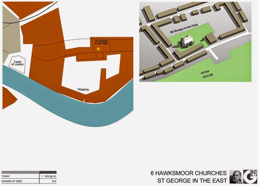
This time we have four entrances at the four corners of the main mass. The vertical circulation is by spiral stairs placed just inboard of these entrances and expressed as towers with pepper pot domes aloft.  These stairs also have doors at ground level, so that galleries and nave seating have separate but interconnected circulation routes. 


Was Hawksmoor dissatisfied with his previous circulation schemes, and looking for ways to get people in and out of the building more fluently ?  Or is he just playing games, ringing the changes ?


By now I am developing a version of the massing model that stands up to closer inspection.  Not yet ready to switch to project mode, but I do want my family to support a more detailed study of the building's composition.  For plan views at a finer scale I am using an embedded detail component.  Not BIM, do you say ?  I beg to differ.  For urban design studies this is an entirely appropriate lightweight method for representing signature buildings within a broader scheme.


The tower is a compromise between the two previous schemes: partially separated from the building but still supported with side buttressing. In the next image you can also see the detailed model side by side with the simpler version.


If St George is due East from the City, Spitalfields is North East, and slightly closer in.  This is a suburb based on textiles, which were the mainstay of the English economy right through the middle ages and into the first half of the Industrial Revolution. 


Once again we touch upon the antagonism between Catholic/Absolutist France and Protestant/Parliamentary England.  Spitalfields was home to thousands of Huguenot silk weavers: refugees fleeing from sectarian violence (sound familiar?)  France's loss was England's gain.  Traditionally England had specialised in coarser textiles: wool and linen.  The Spitalfields weavers added a finer product to the portfolio, often decorated with fancy needlework: a luxury product.


The site is different once again: a corner plot diagonally opposite a large open market square that was covered over in the nineteenth century and still flourishes today.  It has to be a long thin church and luckily the west end is towards the square, so nice opportunity for a grand entrance frontage.  But was it luck ?  Were the sites predetermined or could Hawksmoor/and or the commission negotiate.  I've no idea, let's stick with the notion that the buildings were designed to suit a given site.


This time there are no galleries.  The church is very directional, rows of columns striding down the nave.  There are 2 doors tucked away at the back corners, but the main circulation routes are clearly at the front end: 3 doors entered via a grand portico.


To my eyes, the tower and portico are decidedly odd: something about the proportions perhaps.  Once again there are side buttresses to the tower.  I get the impression that they started as pillars like St George, then got wider to allow for a grand portico and created an opportunity for a concave, linking sweep.  To crown it all is a pyramid, which ends up being more of a gothic spire.
 

Tuesday, November 25, 2014

SIX OF THE BEST

I will return to my obsession with toilets shortly (didn't get time to finish the next post)  In the interim, let's change the subject entirely.

My youngest son now lives in Limehouse.  July was my first time to visit him since he moved, and my first time to visit Limehouse for 30 years. In 1980, I stayed there for several weeks, living & working with friends who had conceived a project for a book called "Squatting: the real story".  We had all been involved in the squatting movement which blossomed forth in London during the 60s and 70s, part of a wider phenomenon of rebellious creativity that infected a whole generation of young people, from the Aldermaston marches to John & Yoko's bed-in.


I was credited as "Illustrator" of the Squatting Book and had a wonderful time generating all kinds of visual enhancements to the various chapters.  It's a wonderful experience to look back on, and I will ever be grateful for Nick Wates & Caroline Lwin for roping me in.  In another life I might have been a graphic artist, but here I am a BIM-crazy architect.


While visiting Tom, I was determined to visit St Anne's, a church by Nicholas Hawksmoor right next door to the converted Seaman's Mission that I stayed in with Nick & Caroline.  I was fortunate to choose a Sunday morning to walk down and take some photographs.  I caught the tail end of a service and was allowed to sneak inside for a few interior shots before they closed the doors.


Back home I slotted these pics into my database of British classical architecture (part of a larger archive that sits on my laptop and has been accumulating for about 15 years now)  I was motivated to spend a weekend re-structuring this section and it occurred to me that Hawksmoor's six London churches would make a very interesting topic for a "BIM study" using some of the techniques I developed while working on my Urban Design presentation for this year's Revit Technology Conference in Chicago.


Hawksmoor is an interesting character, something of an architect's architect, partly because of his willingness to challenge convention (he remains difficult to classify, standing slight apart from the mainstream) and partly because of his tendency to simplify, to strip away ornament and work with stark, geometric masses. 

If you wanted to be really adventurous, you might try to trace a sinuous strand linking Hawksmoor to Soane, via Voysey perhaps & Lubetkin to Foster & Rogers.  That would be a somewhat fanciful response to European accusations that English Architecture has always been tame, conservative and unadventurous. (A stupid accusation in the first place, History is not a competition)


So I made simple massing models of the 6 churches, using the scalable primitives that I had developed.  I had already modelled 2 London churches for my presentation.  (by Wren & Gibbs, representing the generation before & after Hawksmoor, both people he knew as colleagues.) so these provide useful comparisons.

The idea here is to develop buildings in simplified form as families.  In principle these can be taken as generic buildings and scaled up or down (depending on context) for use in Urban Design studies.  In this case we are no using the scaling facility, but it is handy to have lightweight models that can be set in context and/or lined up in a row and compared. 


We have services like Google Earth and Wikipedia these days, so it was easy to find reference information for the sites, old maps, photographs, plans.  I already had a book on Hawksmoor that I purchased several years ago.  The site contexts are also modelled in a highly simplified, abstract style.  I want to focus on fundamentals & I want to achieve my goals within a reasonable time frame.
I found this to be a really great way to get to grips with a really diverse collection of source material and form ideas about the historical period and geographical locations for these 6 churches.  I had to fight the natural tendency to model the context in too much detail.  It's important to find the right level of abstraction  in order to convey the general tone of a building in its setting. The locations are very different, and this has affected both the orientation and planning of the churches.


The churches result from a commission established in 1711, when Hawksmoor was 50 and a well established and respected architect.  Both Wren and Vanbrugh were on this commission.  Wren had employed Hawksmoor during his twenties and thirties, watched him grow from a promising teenager to a mature architect.   Vanbrugh had been collaborating with Hawksmoor throughout the previous decade on various Stately Home projects.  Not surprising that they chose him to lead an ambitious programme to build 50 churches.  (Far too ambitious.  Only 12 were built, half by Hawksmoor)
The churches were built in parallel, with the starting dates slightly staggered.  Roughly speaking they follow an East to West sequence which is a convenient way to organise my comments.  So we start with St Alphege, Greenwich, on a bend in the River opposite the Isle of Dogs.


This is the most traditional of the 6 designs.  It's tempting to imagine that he became progressively more adventurous as he went along, but that's pure speculation and there are also practical explanations for the different approaches.  In any case, he starts with a cruciform plan with a tower at the west end.  This tower is deliberately set away from the main mass with a small linking element.
The church is aligned just slightly off an East-West axis, probably a response to the site which is on a bend in the road.  In order to maintain the traditional orientation with the altar to the East, the church has to put it's back to the road.  As a result, the east façade is rather different from the other 5 churches, more like an entrance façade in fact, with a grandiose broken pediment and deeply recessed "venetian arch".


Greenwich was a small town, sandwiched between the busy dockyards at Deptford and the vast royal estates of Greenwich Park.  These estates contain an architectural gem by Inigo Jones, England's first, great classical architect.  The queen's house defines two grand axes which order the composition of the Greenwich Hospital designed by Wren, with significant contributions by Hawksmoor, who was therefore returning to familiar territory.  Wren was also the Astronomer Royal and designed the observatory on the hill behind the Queen's House, which is of course the setting out point for the zero meridian.


So here we have a resting place for old and injured sailors from the Royal Navy, a dockyard which built many famous ships for that navy as it rose to become the world's dominant sea power, and the origin point for the lines of longitude which were the key to long distance navigation.  The locksmith for this key was John Harrison, whose chronometers still reside in the observatory museum. The accuracy of these time pieces allowed ships to calculate their position with much greater precision.


20 years earlier, the battle of Beachy Head resulted in a shock defeat by France.  The hospital at Greenwich can be seen as part of the reaction to this as the King & Queen strove to rebuild the strength & prestige of the navy.  In order to do this they had to borrow large amounts of money which involved negotiating with Parliament and had two significant side effects.  Firstly parliament further strengthened it's position as a counterbalance to royal power, in contrast to the absolute monarch of catholic France.  Secondly it led directly to the creation of the Bank of England which was set up to manage this loan and played a key role as London rose to become the financial capital of a world dominated by long distance trade.


Greenwich lies opposite the Isle of Dogs.  From 1800 to 1960 this was the heart of Dockland, providing deep water anchorage for the sharp increase in shipping resulting from the Industrial Revolution.  In Hawksmoor's day, the East & West India Companies operated from wharves along the river edge further up stream towards the city.  These wharves had been spreading steadily eastwards and Limehouse represented the extreme limit of this expansion.


Here Hawksmoor had the benefit of a large churchyard and was able to orient his church exactly East-West with the West tower and entrance facing directly down a short side-street.  At Greenwich he had placed the transepts in the middle, as far back as he could reasonably place them.  The transepts act as side entrances, reasonably close to the street, and give direct access to the galleries.  In short he had a logical circulation strategy for a public meeting place.

At Limehouse the congregation approaches from the West and the transepts are brought right up to that end, transforming themselves to side buttresses for the tower.  They have a triple role: entrance, structural support, vertical circulation.


The vertical circulation at the back corners is played down, with two square turrets acting like symbolic tent pegs, to counteract the weight of the tower with its buttressing transepts. 


There is still a short group of river-side houses in Limehouse that date back to the 18th Century.  Narrow street includes "The Grapes" public house which is well worth a visit if you are in the neighbourhood and want to step back in time.  So that brings us back to where we started: St Anne's Limehouse and a wonderful nostalgic Sunday morning, part of my trip back home from RTC Chicago.


I think that's enough for one post.  We'll take a closer look at the other 4 churches next time.

Wednesday, November 19, 2014

PEAPODS

This work was done about 18 months ago.  You might think that urinals are fairly disgusting objects, (in practice they quite often are) but is that an excuse for the pathetic state of current Revit content for this very useful piece of equipment ?  That's roughly what I was thinking when I set about the task of creating some urinals that could sit proudly alongside my classy toilet content (like peas in a pod)
The first one is generic.  I didn't have a particular model in mind, but the general shape and size is very common.  I had previously tried to tackle this in Point World with little success.  After that, almost every time I took a walk down the corridor my mind would drift to puzzling out the geometry ... it can't be that hard, surely ?


One solid half-revolve cut by two voids gets us pretty close.  The extrusion cuts across sideways, and the void revolve hollows out the bowl.  In reality there are usually more subtleties than this, but I'm not looking for an exact replica.  Families aren't instructions for making things ... plumbing families certainly aren't.  They are there to represent an object.  I want them to be roughly the right size and shape, look good in orthographic views, not offend the eye in 3d shaded views, and render up fairly convincingly.


The basic form is almost there, but the sharp edges offend my eyes.  So we export in a solid format (ACIS / SAT) so we can do some rounding off of complex curves in another application.  I notice that I was using Inventor Fusion at first.  This is probably the only time I ventured into that territory.  Later on I realised that the same operation was available in Autocad.


Back in Revit you can explode the geometry to create a free-form solid that accepts material parameters.  Hide this in orthographic views and replace with symbolics. (masking regions and symbolic lines)  I think it is important to do all 3 views (top, side, front)  We often do internal elevations of washrooms with tile setting out etc etc.  Nothing like clean crisp symbolics to make these look good.  If your geometry has sharp edges and is fairly simple, then you may not need symbolics (a table for example)  But rounded, nurbs-like forms are unlikely to show up well in a hidden line elevation.


My next peapod is based on the Duravit Arc.  I didn't have a 3d download for this, just working from dimensioned jpegs.  That's more than adequate for what I want to do.


Actually this one is not very difficult.  Looks a bit scary if you select all the geometry: solids and voids all over the place. 


But it's not hard to figure out for anyone with a bit of experience with family editor. (Vanilla this time)  Important to set up a named work plane for the angled cylinder 


Once again the secret to making rendered views convincing is the softening of the edges so that they pick up the right kind of reflections.


Excited by my progress I went on to set up a rendered view on a tiled background.  This is a fairly low-res version by it gets the message across.  As far as I am concerned, this is a huge improvement on the urinal families that I have found on the web.  I even got excited enough to model a towel draped over a towel rail.  Nothing difficult in that, just a sweep, but taking care to shape both the path and the profile as gentle curves.


I'm not going to describe all these fittings in great detail.  I went on to make the Vero, McDry, Bill and Starc 1 (all Duravit) Other manufacturers have similar looking models so they could be useful even when you are not specifying Duravit. 


The Vero is a fairly straightforward modelling exercise in Vanilla mode.  Later on I adapted this to create a "Series" urinal & screen by RAK ceramics.  RAK are our local UAE manufacturers of ceramics producing good quality sanitary ware and tiles that are very competitive in the regional market.


McDry was modelled in point world.  As the name implies, this is a waterless type of urinal.  I haven't got around to exporting to SAT and rounding the edges on this yet.


The Bill is a slightly more elaborate modelling task, so I opted for using a CAD import for the moment and used my time to create the symbolic work in plan and elevation.  (This is DWG, not SAT, so everything vanishes if you try to explode it)  It's interesting to note that the orthographic views provided as downloads don't match the 3d file.  The boundaries are pretty much the same, but the internal lines (intended to represent 3d curves) are quite different.  I've noticed this before with downloads from other sources.  It doesn't matter much to me.  As long as the "footprint" is accurate and the overall impression is convincing, that's all I really want.


So I have at least 4 different strategies to choose from when modelling sanitary ware depending on my source material. 
 
  1. I can use a 3d CAD import and apply materials via Object Styles/imports in families.
  2. I can explode the CAD import (if it's a true solid, like SAT format)
  3. I can model in vanilla Revit
  4. I can model in Point World, export to SAT, re-import and explode
 
Option 3 is first choice: small file sizes and directly applied material parameters
Option 4 is good for curvaceous shapes, but go easy on the edge fillets and expect file sizes of between 1 and 2mb
Option 2 is fast and easy, but only possible if the right kind of download is available (rare)
Option 1 is also fast, but end users need to understand how the materials assignments work and you will have undesirable seams in shaded views.
 
In my view they are all useful methods which can help us to assemble a much better library of Plumbing Fixture content. 
 
More to come, including access to my work-in-progress Duravit families.  Stay tuned :-)


Thursday, November 13, 2014

YET MORE TOILETS

This post is no three of a series on sanitary ware familes.  Last time we modelled a Duravit toilet and bidet.  Here are 2 more of their bidets, which are available as 3d CAD downloads.  Nicely modelled, but as usual they contain seam lines that spoil our 3d shaded views, and of course you can't apply material parameters without resorting to nasty workarounds.  The Puravida also has a missing face.


These two bidets are quite easy to model using the techniques described in the previous post.  The D code is intact, so we could CAD import it into a Revit family.  We would need to separate out the metal fittings so they can pick up a different material for rendering purposes.  (If you are specifying Duravit you probably want to be able to render)  We also need masking regions and symbolic lines in plan & elevation. 

But once we've gone to that much trouble, why not go the extra mile and create native Revit geometry ?  It is possible to assign materials to the CAD layers via Object Styles, assuming the different materials are on different layers.  But really it would be so nice if we could just download well-made Revit families with all the metadata etc all nicely set up.

So here's how I would make the Puravida.  Drop the CAD family into a GMA or massing family.  I find it useful to set Reference Lines to thick red under Object Styles.


Draw the base profile.  You need to change the scale of the views you are working in so the line weights are manageable.  I'm using 1:5.
In a side elevation, create some horizontal reference planes and name them (I just used 1,2,3,4)  Select the base profile and copy multiple.  You have to keep unchecking "constrain" for each new instance.


Now we need to adjust the shape of each profile.  I started by selecting the whole thing (6 segments)  Then I use shift-window to deselect that straight segment at the far left.  Now I can nudge the rest to the right and this will adjust the length without spoiling the smooth tangential curves.


Keep on like this until you have a series of profiles that hug the CAD object quite closely.  Now select them all and "create form".  Looks pretty good.


The void inside the bowl is done in a similar way.  I call this "freehand" work because you are drawing profiles directly on ref planes instead of creating a separate parametric profile family.  I don't have any fixed rules about which method to use, just treat each case on its merits.  This one was definitely much easier with the freehand method.  I don't need the parametrics, just making one fixed shape


Now we can export as SAT and load into Autocad.  Sparing use of the solid fillet command to soften the sharp edges.  You will notice that we have very similar seams to those in the original CAD file, interestingly though most of them disappear later when you explode the geometry back in Revit.


The tap / faucet in the CAD download is quite an interesting shape so I accepted this as a modelling challenge.  The tricky part is in making a transition from a circle to a rectangle with rounded corners.  Ultimately I realised that the key to a smooth transition was having the same number of segments in each profile.  So I just broke the circle into 8 arcs. 


The finished article has 3 parts: extrusion, loft and revolve.  Don't try to make the body all as one loft, the cylindrical portion will never come out quite straight because you are telling Revit to create a continuous curve connecting all the profiles.

I usually use both material parameters and subcategories.  Most of the time the subcategory will control the materials for all the sanitary ware in the project, but just in case one fitting needs to be a different material (gold plated perhaps) ... well you get the idea.


Introducing TIM, my Toilet Information Model.  Nice clean symbolic work in all 3 directions.  The 2d world of orthographic is very important in my view.  By all means let's do away with hard copies, but the conceptual clarity of plans and sections is invaluable.  It helps us to think, to make decisions, to understand problems.  Don't knock 2d.  Be inclusive.  It's a free world.
Oh yes, nearly forgot.  Look how much cleaner my version is than the original CAD download.


Once you have that one made (floor standing) it's relatively simple to backtrack a bit and adapt it to make the wall hung version.  Adjust the profiles, export to SAT again, round the corners, back into Revit, explode ...


After that I went on to make the matching WC.  Same methodology.  Cut across with a sideways void extrusion (like we did in the last post)  Round the edges in Autocad once more.  I don't bother cutting out the bowl for toilets.  Going to show them with the lids down, much simpler.


Turning now to some wash basins.  It turns out that the Happy D basin downloads are in SAT format and can be exploded in Revit.  Whoopee, no need for me to do lots of lofting, just remove the chrome bits and replace them with separate families for easier control.


I decided to use visibility controls to permit swapping of the half pedestal and full pedestal versions.  These are slightly heavyweight families (welterweight ?) so I figured that it was better to combine two in one.


Anyway that was a fun weekend, some time about a year ago I think.  It's embarassing how long it takes to convert some of my work into a presentable format for sharing with the world.  But I do have a day job.  That being so, why am I spending my precious time fiddling with toilet families that should be available for download ?


The short answer is that ... they aren't.  The slightly longer answer ?  I enjoy making good quality content and somewhere deep inside I am kind of hoping that I might eventually motivate others to contribute.  Who knows, Duravit themselves might eventually come tho the party.


I'm going to put some of these families up for download.  I am appealing to the many experienced users out there who follow my blog to test them out and give feedback.  What improvements can you suggest ?  By all means make some changes and send them back.  And please lobby your contacts in the supply chain to make more BIM content available.  In the end it's up to us.